Ever wonder if your coffee could speak in numbers? Imagine your brew coming to life through colorful charts and graphs, each one pulsing with the beat of your perfect cup. It’s like watching the warm glow of freshly brewed coffee reflected in a mirror of data.
We take simple sensor readings – that means devices checking temperature and brew time – and turn them into easy-to-read insights. Picture real-time updates that guide you step by step in crafting that magical cup. A hint of science meets the art of brewing, all wrapped in an experience that feels as satisfying as that first sip in the morning.
Visualizing Real-Time Digital Coffee Brewing Metrics with Interactive Dashboards
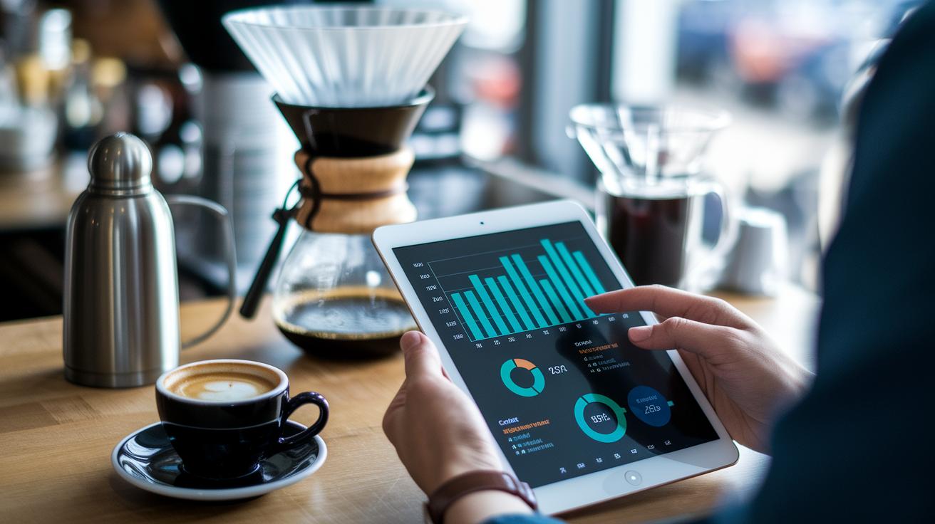
Real-time dashboards give you an instant look at your coffee's journey. With an interactive brew dashboard, you can track key numbers like temperature, brew time, extraction yield, and TDS (that’s a simple way to measure coffee strength) as they update every moment with a timestamp. This means you’re always seeing the freshest readings, so if something drifts off course, you can quickly adjust it. Imagine a cozy café chain keeping an eye on these details over eight weeks in four different spots, it's like watching your brew’s heartbeat, where every number tells a little story.
Setting up your dashboard is both fun and super practical. When sensor-driven data (data coming from gadgets that check things like temperature) feeds directly into your display, you get a crystal clear view of each step in your brewing process. You connect your sensor data, watch each reading come alive on the screen, and get tips on tweaking things to keep your brew perfectly balanced. This shift from guesswork to smart precision means you can easily fine-tune details like grind size and brew time. A thoughtful dashboard design, with clear charts, timely alert signals, and a neat layout, helps you zero in on what matters most.
- Data source connection
- Chart selection
- Alert thresholds
- Layout design
| Metric | Recommended Chart Type |
|---|---|
| Temperature | Line Graph |
| Brew Time | Bar Chart |
| Extraction Yield | Control Chart |
| TDS | Gauge |
Chart Types for Brewing Performance and Digital Coffee Data Displays
Picking the right chart is like choosing the perfect coffee blend, it helps you see the trends in your brew at a glance. A well-made display lets you notice small changes in temperature, brew time, extraction yield, and TDS, so you can quickly tell if your brew is following that trusty 15 15 15 rule.
There are a few types you can use:
- Line: This chart shows smooth trends over time, such as a slow rise or drop in temperature.
- Bar: Great for comparing extraction yields from different batches, offering a clear side-by-side look.
- Control: This one checks if your brewing numbers stay within set limits, keeping your process on track.
- Heat Map: It shines a light on spots where performance shifts, like when a change in water flow hints at a problem.
- Scatter: Use this to see how two factors relate, such as matching the grind size with the yield.
- Gauge: This gives you a quick snapshot of current readings compared to your goals, all in real time.
When you choose a chart, think about the story your data tells. Use line and gauge charts to track changes over time, and control charts to keep an eye on performance limits. This careful approach makes the brewing process clearer and turns your digital coffee data into something you can really work with.
Sensor Data Mapping Infographics for Digital Coffee Brewing Insights
Mapping sensor data with infographics is like turning a bunch of numbers into a friendly, easy-to-follow story. When you set up temperature probes at the start of pre-infusion and flow meters at the brew’s output, you’re getting spot-on readings that show exactly what’s happening at each step, from grinding the beans to extracting the brew. It almost feels like you can smell the fresh grind and taste the perfect balance.
Infographics also help you focus on what really matters. Think of the 80/20 rule: a few key details can shape 80% of your coffee’s flavor. By sketching out the sensor layout and data flow through steps like the grinder, dose, bloom, and extraction, you create a handy roadmap of your coffee’s journey. Ever wonder how a tiny tweak can make your cup even better?
• Place sensors exactly where they count.
• Create simple, step-by-step diagrams to show how data moves.
• Mark up visuals to highlight the details that bring out the best flavor.
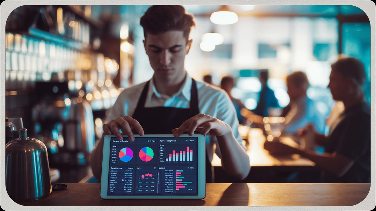
Designing KPI Dashboards for Precision in Digital Coffee Brewing Metrics

We bring together key brew numbers with smart sensor checks to capture every subtle shift in your coffee's quality. Think of it like this: a cozy café once adjusted its sensor settings. Before, every cup was a mixed bag, but after a little fine-tuning, each shot turned out just right with balanced extraction and TDS. It’s not just about pretty charts, it’s about real-time data that tells you exactly when to make that tweak.
| KPI | Target Range | Chart Type |
|---|---|---|
| Extraction Yield | 18%–22% | Control Chart |
| TDS | 1.25%–1.35% | Gauge |
| Flow Rate | Optimal Setting | Line Graph |
Here’s how you can make the most of this approach:
- Combine extraction yield, TDS, and flow rate into one easy-to-read score.
- Check your sensor settings regularly so your measurements stay sharp.
- Look at time-stamped data to see how small adjustments improve your brew over time.
- Focus on the vital numbers that have the biggest impact on your coffee’s taste.
Step-by-Step Implementation of Visualization Tools for Digital Coffee Brewing Metrics
Starting the Data Capture Process
Let’s get started on capturing data from your brew machine. Picture this: raw sensor logs transformed into simple, easy-to-read reports that help you fine-tune things like temperature, brew time, extraction yield, and TDS (that’s the measure of coffee strength, in plain language). It’s a smooth blend of automated tools and real-time sensor info that lets you tweak your brew as you're sipping.
- Data export – First, export the logs from your brew machine. This step gathers every sensor reading so you can review them later.
- Calibration – Next, adjust each sensor to capture accurate temperature and flow data. Check out our guide on sensor-calibrated coffee extraction for quick tips on setting timestamps and fine-tuning your devices.
- ETL – Then, extract the data, transform it into a clean format, and load it into your analytics platform. This process turns raw numbers into visuals you can easily understand.
- Dashboard setup – Create interactive screens that show your key brew metrics. A clear layout with simple charts makes it easy to see what’s happening at a glance.
- Alert config – Set up alerts to notify you if any crucial readings like extraction yield or TDS fall out of line. That way, you’re instantly in the loop.
- Training – Show your team how to read the dashboards and adjust settings based on the live data. It’s like sharing your favorite coffee recipe with a friend.
- Monitoring – Finally, track real-time trends and sensor performance at all your brew spots. This helps you catch any odd changes quickly.
Regular upkeep is key. Checking your sensors and dashboard often helps you spot any drift or software hiccups, keeping your reports accurate and your brewing process on point. Enjoy the journey of perfecting your brew and savor every sip!
Best Practices and Future Trends in Digital Coffee Brewing Metrics Visualization
Cloud-based platforms and interactive dashboards are changing the way we watch over our brew process, much like a friendly chat over coffee. These smart tools mix up-to-the-minute data with an easy-to-read format that helps you notice any little shifts in your brew as they happen. By using modern visuals, coffee lovers can keep an eye on trends, spot any hiccups early, and even foresee when equipment might need a check-up. This hands-on approach makes every cup feel just right, backed by clear, smart insights.
- Mobile-first design helps you check your brew on the go.
- Responsive charts adjust smoothly to any screen.
- Real-time alerts let you know when readings stray from the target.
- Modular panels mean you can set up your dashboard just the way you like it.
- Friendly training builds your confidence in using these interactive features.
Looking ahead, new tools promise even more engaging ways to see your brewing data. Dynamic chart libraries, which let you dig deeper into your brew details, are setting the stage for richer insights. Upcoming remote diagnostics and combo visual modules are expected to make a big splash in 2024, paving the way for predicting maintenance needs before they become a problem. With these innovations, your digital brewing dashboard will soon do more than just display data, it will help guide you to that perfect cup every time.
Final Words
In the action, we explored the essentials of setting up interactive dashboards that capture key brew metrics in real-time. We broke down the process, from selecting the proper charts and sensor mapping to implementing detailed KPI dashboards and step-by-step analytics routines.
This guide showcased practical data visualization techniques for digital coffee brewing metrics while offering insight into best practices and future trends. Enjoy every sip of innovation as you refine your brewing process and perfect that reliably delicious cup.
FAQ
What are the four methods of brewing coffee?
The four methods of brewing coffee include drip brewing, French press, espresso, and cold brew. Each method extracts coffee in a distinct way, giving you a unique flavor and aroma in your cup.
What is the quantitative analysis of coffee?
The quantitative analysis of coffee involves measuring elements like temperature, brew time, extraction yield, and TDS. This data helps brewers understand and refine the science behind every cup.
What are the variables in coffee brewing and what five variables do we strive to control in coffee brewing?
The variables in coffee brewing include temperature, brew time, extraction yield, water-to-coffee ratio, and grind size. Controlling these five factors supports a balanced, consistently delicious cup.